
Website Terminology Glossary
Layout
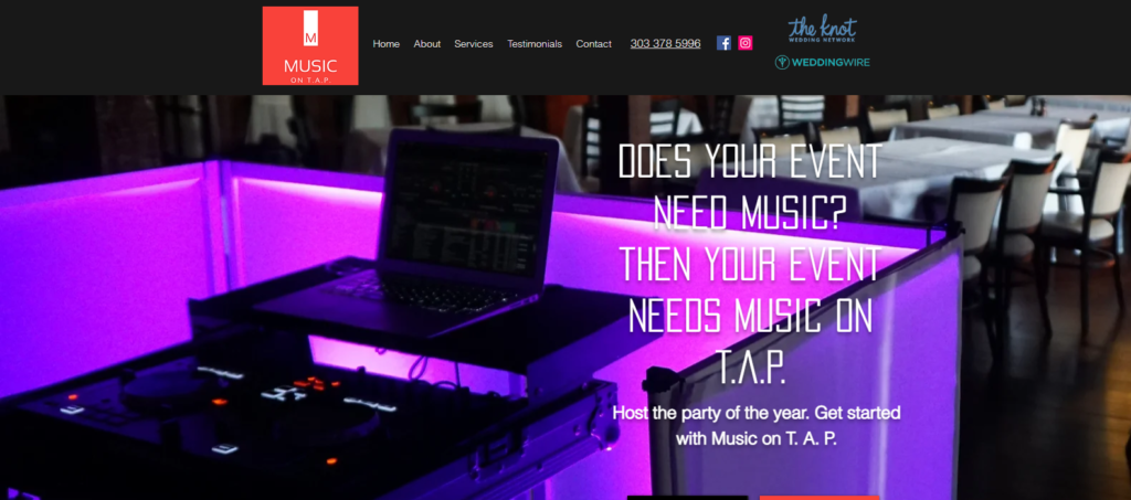
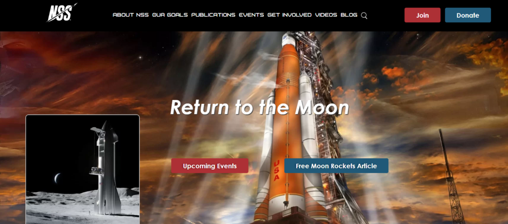
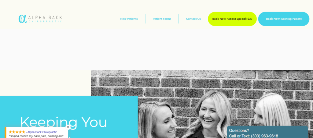
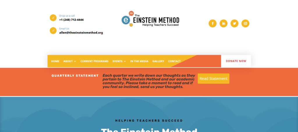
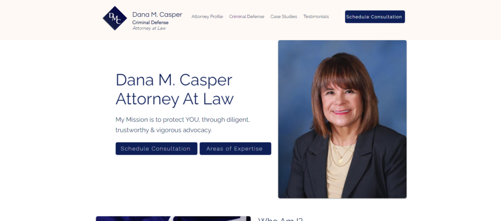
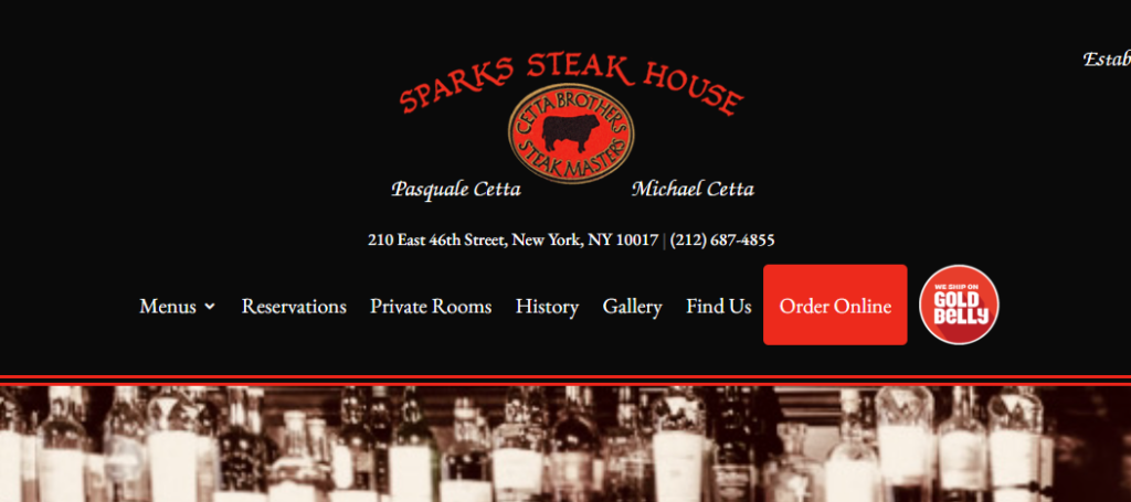
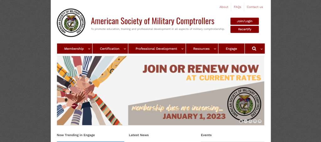
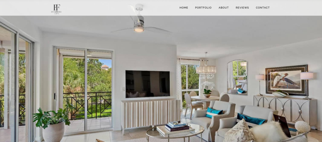
Website layout refers to the arrangement of the various elements on a webpage, such as text, images, navigation, and other design elements. A well-designed layout can make a website visually appealing, easy to use, and effective in achieving its goals.
There are several different website layout types, including:
Fixed layout
In this layout, the size of the website is fixed, and the content is displayed within a specific width and height. This type of layout is commonly used for simpler websites or websites with a limited amount of content.
Fluid layout
In a fluid layout, the size of the website adjusts to the size of the browser window. This type of layout is more flexible and can accommodate different screen sizes and resolutions.
Responsive layout
A responsive layout is a type of fluid layout that adjusts to different screen sizes and resolutions, providing an optimal viewing experience on all devices.
Grid layout
Grid layouts use a system of rows and columns to organize content on a webpage. This type of layout can be used to create a balanced and visually appealing design.
Asymmetrical layout
An asymmetrical layout uses an irregular grid and non-uniform shapes to create a unique and eye-catching design.
Magazine layout
A magazine layout is a type of layout that mimics the design of a print magazine, with a mix of text and images arranged in columns.
Minimalist layout
A minimalist layout uses a simple design with minimal elements to create a clean and modern look.
The website layout is an important aspect of web design, as it can affect the user experience and the effectiveness of a website in achieving its goals.
Need Help With Layout ?


Your online success is our mission.
Check Out Our Work


